24 March 2010

Learning to SEE

“I am teaching you how to see as opposed to merely looking.” – Carlos Castaneda

Whether one buys the premise that Carlos Castaneda was a powerful acolyte on the Yaqui Warrior’s Path of the Nagual or was instead a New Age hoax that bewitched a generation of dreamy-eyed, latter-day hippies, there are some interesting philosophical concepts bandied about in his ten books. One that has always stuck with me and seems apropos to the world of photography is the Art of Seeing.

In the Castaneda books seeing is the ability to look beyond our current, facile reality into the realm of magical entities and pure energy. This, as opposed to merely looking, as in “to look at something” which implies a superficial glance. Fine-art photographers don’t have to wax metaphysical to understand the requirement to see things differently than others. Bill Brandt – the preeminent British photographer of the 20th century – said it best when he wrote: “It is part of the photographer’s job to see more intensely than most people do. He must have and keep in him something of the receptiveness of the child who looks at the world for the first time or of the traveler who enters a strange country.”  

As photographers, our visual antennae must be all-aquiver, attentive, and receptive to see the artistic possibilities that abound around us. Often that also means getting out of our comfort zone. Comfort zones are just that and we hang out in them quite a bit because they are, well, comfortable (read: non-challenging). But they are also constricting us to what we allow ourselves to know and see. That, I believe, is why photowalking outings can be so interesting. It forces you to deal with (see) subject matter you normally might merely glance at and saunter past with little thought or appreciation. I was at a recent club-organized photowalk in an old train station. It was fascinating to watch how the many photographers would approach differently the subject matter of four walls, tiled floor, and high windows and ceiling. It was also interesting to see how the passers-by would stop and look – perhaps even SEE – the station details because people with cameras were doing the same.

Go on your own photowalking jaunt, or pick themed projects to occasionally work on. Venture from your comfort zone on occasion and look for challenges that do just that. My personal goal is not to stop looking around, but to start seeing more.

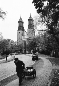
Up_train_stationUofu_fountainPicklesCemeteryNara_manholePoznanGallivan_centre

08 March 2010

Burgers as a Metaphor

I admit it: I’m biased...but so are you. Don’t deny it, it’s just one of those human failings we must struggle against.

I see a photo of a subject I’m not in the remotest interested in — let’s say (in my case) rodeo or perhaps snowmobiles doing barrel rolls to the squeals of a thousand fist-pumping fans — and my GSU (Gut Sensory Unit) begins sending warning signals to my brain: “BORing, not for you, wander ye eyes somewhere else,” etc. But, if the photo is good, I mean really good, something different happens: the brain kicks in and the GSU is quieted by a simple: “huh!...interesting...that is well done!” Our (well, perhaps only MY, but I seriously doubt it) initial Gut reaction is often to the subject matter. Not always, mind you, but often enough the bias gets in the way and says “yuck...wha?...stoopid!” before we let the composition and intrinsic beauty settle in. Is it Gut versus Brain? Not really, I just think we are hard-wired to react before analyzing. That we can eventually analyze (I’m speaking again for myself here) is a VGT (Very Good Thing). We can — if we permit/push ourselves — move beyond first glance, our gut feel, to an analytical level that can be equally valid as the intuitive. Are those tensions in competition or collaboration? There is visceral and there is intellectual and then there is the vast greyness in betwixt. We choose where to hang out.

With that in mind, can a vegetarian appreciate a good burger? Can she or he look at a well-crafted photo of a hunk of cooked animal and say: “well done!” (No pun intended.) Can they go beyond the utterly visceral (and repugnant) impact of that image to applaud the skill and aplomb of the photographer? It may never be appealing on a gut-level but can the brain give it a passing score?

I’ll ask my wife...

Imgp5257-vf-vbImgp5278-vf-vbImgp3465-vf-vb

03 March 2010

It's a god-forsaken desert!

“It's a god-forsaken desert!” … was one individual’s dismissive and all-encompassing comment about Utah’s West Desert. A rallying cry of sorts, in this particular case to dump nuclear waste, but really this is of the extractive/exploitive mindset that really can’t imagine a land that exists for its own sake. I won’t get into a deconstructivist mode that examines how he presumes to know what God (if he/she/it exists) does or does not forsake, nor will I explore the irony behind what  was once a horrid barrier to avoid or cross at one’s peril becomes a place of attraction and renewal (think Manly in 1849 struggling to lead a wagon train through a valley now known as Death). Instead, these images – all shot within ~50 miles of the “forsaken” location and hence presumably “forsaken” as well – speak for themselves. In the end, even though as a wise person once opined, “One man’s heavy metal is another woman’s opera,” it is also true that actions – and inactions – have consequences. Let decisions be guided by both maxims.

Ut-20080404-dsir0388-bw-vfUt-20080319-dsir0320-bw-vfUt-20080404-dsir0391-bwUt-20080217-dsir0251-bw-vfUt-20070317-img_0027-bw-vf20080217-dsir0225-bw-vfUt-20070317-img_0041-vf

24 February 2010

When is an Apple not an Apple?

When it is a 32-bit HDR file and not a tone-mapped file.

In my last post I attempted an apples-to-apples comparison of tone-mapped output from several High Dynamic Range (HDR) applications. The goal was to utilize the ‘default’ tone-mapping setting in each of the apps and present those outputs. I got it about ?? right.

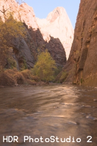
Both Photomatix Pro and HDR Essentials do in fact have default settings so I believe those comparisons are valid. However, in the case of Photoshop’s Merge to HDR tool and Unified Color’s PhotoStudio 2, neither really have a “default” setting for tonemapping. In fact the images I output from those programs were essentially tiff conversions of the 32-bit HDR file. Most monitors cannot adequately display those files so they don’t look quite right. In the case of PhotoStudio 2 after merging the files you are presented with the HDR file and expected to begin your dynamic-range editing there either manually with the various controls or by applying pre-sets (or ‘recipes’) if you have any loaded. With the Merge to HDR function in Photoshop, once the 32-bit file is created you may output it tone-mapped in a number of ways, none of which can really be considered ‘default.’

Both of the above models are different than the mechanisms either Photomatix or HDR Essentials utilize in preparing your file for output. In Photomatix, after merging the files you are presented with a 32-bit HDR image that you may save (as a Radiance file for instance) before selecting the Tonemapping button which takes you to that section of the workflow where default values (as set by the developer) may be applied in either the Details Enhancer or Tone Compressor modes. HDR Essentials does not show you the 32-bit file (though you may save it as a Radiance file and open it in Photoshop) but instead jumps you directly to the default, ‘factory-settings’ for tone-mapping as specified in preferences.

A more true comparison would have been to show all of the HDR (32-bit) file outputs but since our monitors can’t display them properly, nothing of value would have been gained from that. As it was, showing default tone-mapped files aside HDR files was confusing at best. To correct this (to some degree anyway) I have output a tone-mapped file from both Photoshop (using the Local Adaptation method) and PhotoStudio (with various local and global adjustments manually applied). Neither of these files are meant to represent the full capabilities of the applications or methodologies applied. But instead I include them here to show you how far from a 32-bit HDR file you can go via their various tone-mapping schemes and tools. Unified Color’s product in particular has very granular controls to permit potentially endless fine-tuning.

In the end, the best bet is download and try the various apps for yourself. Use the same set of files and see how easy and how long it is before you get output you are satisfied with. Time, interface ease, and final output should all be calculated into your final application decision.

Hdr-9973-9977Untitled_hdr2

20 February 2010

Default HDR Output Examples

I thought this was an interesting comparison, though by no means totally decisive as to which High Dynamic Range application one should purchase and use. I ran the same three exposures through three different HDR programs plus Photoshop CS3’s Merge to HDR function. I used the default settings on all of these apps, so as to keep the comparison as close to “apples-to-apples” as possible. Obviously, changing the parameters in the various programs could/would/should improve the output.  Nonetheless, the default results are telling, though the story may be up for interpretation.

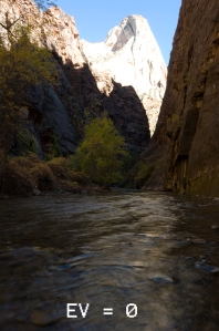
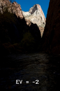
My original RAW exposures are at EV 0, EV+2 & EV-2. These then where processed accordingly:

-          Photoshop CS3’s Merge to HDR function: one HDR output

-          Unified Color’s HDR PhotoStudio 2: one HDR output

-          Essential HDR, version 1: two outputs, one using the Details Revealed mode and the other using the Fast Tone Balancer mode

-          Photomatix 3: three outputs using Tone Compressor, Details Enhancer and the non-HDR blending mode of Exposure Fusion

Looking at the original 3 exposures and then the Photomatix HDR outputs (all three!) it seems pretty clear to me that out of the proverbial starting gate Photomatix better positions your images. They have richer colors, more details, believable contrasts and less strange “HDR-like” artifacts. This is not to say that the other apps presented useless images (well, the Photoshop output was just plain terrible), but all of them would require more work in Photoshop to bring them into the same league with the Photomatix images.

Mind you: This was just one test. Other images with different contrast ratios and color schemes should be tried with the other applications (though not with Photoshop’s Merge to HDR…I’m done with that!) before one could definitively say who the winner would be of this HDR shootout. I’ll continue to explore the other apps and perhaps new ones as well. But I must say, for my HDR work, currently I’ll just be clicking on the Photomatix icon.

Imgp9973-0_copyImgp9976-2_copyImgp99772_copyImgp9973_6_7_tonemapped-ps_copImgp9973_6_7_tonemapped-hdrps_Imgp9973_6_7_tonemapped-hdrest0imgp9973_6_7_tonemapped-hdrestImgp9973_6_7_tonemapped-pm-def0imgp9973_6_7_tonemapped-pm-defImgp9973_6_7-pm-fuse_copy

12 February 2010

I Hate HDR! (A Subjective Analysis)

I Hate HDR! If you know my photography, you know that statement is not true. But
researching and putting together an HDR presentation/tutorial I will be
giving next week, I came across a number of posts, blogs, discussion groups,
etc., that professed extreme distaste for all things HDR. It made for some
amusing reading and has provided me with enough juicy quotes to populate one
of my slides (my favorite: "It's like a bad acid trip!"). Reading deeper, of
course, revealed a number of interesting insights:

1) It's a "religious war!" As most heated, opinionated discourses are.
Film versus digital, Mac versus PC (versus Linux), reformation versus
counter-reformation, deedle-dem versus dweedle-rep, ad infinitum. It's
usually the chatter of the extremists who drown out the commonsensical
discussion of the middle-ground.

2) In one corner the Absolutists and the other the Relativists!...or,
if you prefer, the purists against the whatever-floats-yer-boaters. I
certainly am not a purist (in the 'old days' it was frowned upon to crop an
image) but neither am I an all-things-are-equal. To me there is a
qualitative difference between a Caravaggio and the doodlings of my nephew
(whom I nonetheless love dearly). 3) It's a tool, folks! Just like the proverbially pen or sword, imbued
with neither intelligence nor intent. What the individual uses those tools
for or even how they use them determines it's subjective value. 4) There be luddites! Amongst the chatter you could still read the
anti-digital and/or anti-Photoshop sentiment of some. In the "good old days"
(defined by whomever parrots that phrase) people created Real Art with hard
work and painstaking hours in the darkroom. Yes, I am in agreement: very
good Art was created in the past. But the democratization (and, that is what
it is) of digital and the Internet has spawned a multi-order-of-magnitude
outpouring of images that we can waste our days clicking through. This has
fundamentally changed the way we perceive photography. I can just as easily
view the work of incredibly talented photographers on Flickr whilst I am
also just one link away from gawd-awful dreck. C'est le nouvelle vie!

5) When the technique gets in the way of the image, it's not art! I'm
sure Monet, Renoir, Rodin, van Gogh, Munch, Picasso, Pollock, etc., etc.,
heard the same thing. This does not in any way equate my over-cooked HDR
image in this post with The Scream, mind you, rather, we should be very wary
of condemning a technique or methodology because of the technique or
methodology. 6) Well, really it's just the over-cooked images I'm objecting to.
Okay, now we are getting somewhere. Not necessarily because those images
suck (which they may well), but because we are now reasonably recognizing
that it is NOT the technique that's at fault but rather we just don't like
SOME of the output. Breakthrough!

Many photographers DO recognize that HDR and its related techniques are a
breakthrough of sorts. For these photographers subtlety is the key (sHDR?):
tamed skies, no halos, contrast and some shadows. You will find their
postings far more frequently than the shrill cries of anti-HDR people. It
really is a tool to use or abuse or ignore. The choice is yours. I wouldn't
campaign one way t'other. I just know that it is an important technique for
me but I also recognize that my tastes and proclivities will change over
time (thank Buddha). I hope people will appreciate my images for WHAT they
are and not obsess over how I created them. Hope is a good thing.

Imgp9973_4_5_60imgp9973_4_5_6


10 February 2010

Look at your feet...occasionally

A fellow photographer friend (let’s call him Will) was telling me a story about a group photo shoot at the SLC Main Library (http://www.flickr.com/photos/clayhaus/3955090258/in/set-72157613429118501/). (If you don’t know this building it is an award winning modern structure with enough movement and interest that it won over this die-hard lover of Romanesque and Gothic architecture.) While the other photographers were scattered about getting the best angle on the sweep and flowing lines of glass, concrete and metal, Will was aiming his camera at a puddle. Someone came up to him and said: “With this beautiful building in front of you, you shoot a puddle?!” Will said something to the effect of: “There are plenty of others to shoot the building…no one is capturing this puddle.” Now, whether this puddle was ‘worth’ capturing is not the point (and perhaps a subject for another post).

Another example: Ansel Adams was shooting with his friend Brett Weston. In those days Brett was carting around a 11 x 14 field camera while Ansel ‘only’ had an 8 x 10. So there is Ansel setting up for one of his gorgeous zone-system-to-the-max landscapes and he looks over at Brett and starts laughing. Weston had his massive camera pointed at a pile of leaves some 5 feet away. If you have ever seen any of Weston’s foliage shots, you know THEY were worth it.

The photos in this post show 3 different examples of looking at a scene. All were shot at about the same vantage point at Cardiff Creek, just below Donut Falls. However, each photo has a very different feel. I’m not saying which is “best” – though I have my favorite – just that as landscape photographers we shouldn’t always keep our eyes fixed on the horizon. Scan the skies…then look at your feet!

Imgp1182-vfImgp1180-vfImgp1179-vf