03 March 2010

It's a god-forsaken desert!

“It's a god-forsaken desert!” … was one individual’s dismissive and all-encompassing comment about Utah’s West Desert. A rallying cry of sorts, in this particular case to dump nuclear waste, but really this is of the extractive/exploitive mindset that really can’t imagine a land that exists for its own sake. I won’t get into a deconstructivist mode that examines how he presumes to know what God (if he/she/it exists) does or does not forsake, nor will I explore the irony behind what  was once a horrid barrier to avoid or cross at one’s peril becomes a place of attraction and renewal (think Manly in 1849 struggling to lead a wagon train through a valley now known as Death). Instead, these images – all shot within ~50 miles of the “forsaken” location and hence presumably “forsaken” as well – speak for themselves. In the end, even though as a wise person once opined, “One man’s heavy metal is another woman’s opera,” it is also true that actions – and inactions – have consequences. Let decisions be guided by both maxims.

Ut-20080404-dsir0388-bw-vfUt-20080319-dsir0320-bw-vfUt-20080404-dsir0391-bwUt-20080217-dsir0251-bw-vfUt-20070317-img_0027-bw-vf20080217-dsir0225-bw-vfUt-20070317-img_0041-vf

24 February 2010

When is an Apple not an Apple?

When it is a 32-bit HDR file and not a tone-mapped file.

In my last post I attempted an apples-to-apples comparison of tone-mapped output from several High Dynamic Range (HDR) applications. The goal was to utilize the ‘default’ tone-mapping setting in each of the apps and present those outputs. I got it about ?? right.

Both Photomatix Pro and HDR Essentials do in fact have default settings so I believe those comparisons are valid. However, in the case of Photoshop’s Merge to HDR tool and Unified Color’s PhotoStudio 2, neither really have a “default” setting for tonemapping. In fact the images I output from those programs were essentially tiff conversions of the 32-bit HDR file. Most monitors cannot adequately display those files so they don’t look quite right. In the case of PhotoStudio 2 after merging the files you are presented with the HDR file and expected to begin your dynamic-range editing there either manually with the various controls or by applying pre-sets (or ‘recipes’) if you have any loaded. With the Merge to HDR function in Photoshop, once the 32-bit file is created you may output it tone-mapped in a number of ways, none of which can really be considered ‘default.’

Both of the above models are different than the mechanisms either Photomatix or HDR Essentials utilize in preparing your file for output. In Photomatix, after merging the files you are presented with a 32-bit HDR image that you may save (as a Radiance file for instance) before selecting the Tonemapping button which takes you to that section of the workflow where default values (as set by the developer) may be applied in either the Details Enhancer or Tone Compressor modes. HDR Essentials does not show you the 32-bit file (though you may save it as a Radiance file and open it in Photoshop) but instead jumps you directly to the default, ‘factory-settings’ for tone-mapping as specified in preferences.

A more true comparison would have been to show all of the HDR (32-bit) file outputs but since our monitors can’t display them properly, nothing of value would have been gained from that. As it was, showing default tone-mapped files aside HDR files was confusing at best. To correct this (to some degree anyway) I have output a tone-mapped file from both Photoshop (using the Local Adaptation method) and PhotoStudio (with various local and global adjustments manually applied). Neither of these files are meant to represent the full capabilities of the applications or methodologies applied. But instead I include them here to show you how far from a 32-bit HDR file you can go via their various tone-mapping schemes and tools. Unified Color’s product in particular has very granular controls to permit potentially endless fine-tuning.

In the end, the best bet is download and try the various apps for yourself. Use the same set of files and see how easy and how long it is before you get output you are satisfied with. Time, interface ease, and final output should all be calculated into your final application decision.

Hdr-9973-9977Untitled_hdr2

20 February 2010

Default HDR Output Examples

I thought this was an interesting comparison, though by no means totally decisive as to which High Dynamic Range application one should purchase and use. I ran the same three exposures through three different HDR programs plus Photoshop CS3’s Merge to HDR function. I used the default settings on all of these apps, so as to keep the comparison as close to “apples-to-apples” as possible. Obviously, changing the parameters in the various programs could/would/should improve the output.  Nonetheless, the default results are telling, though the story may be up for interpretation.

My original RAW exposures are at EV 0, EV+2 & EV-2. These then where processed accordingly:

-          Photoshop CS3’s Merge to HDR function: one HDR output

-          Unified Color’s HDR PhotoStudio 2: one HDR output

-          Essential HDR, version 1: two outputs, one using the Details Revealed mode and the other using the Fast Tone Balancer mode

-          Photomatix 3: three outputs using Tone Compressor, Details Enhancer and the non-HDR blending mode of Exposure Fusion

Looking at the original 3 exposures and then the Photomatix HDR outputs (all three!) it seems pretty clear to me that out of the proverbial starting gate Photomatix better positions your images. They have richer colors, more details, believable contrasts and less strange “HDR-like” artifacts. This is not to say that the other apps presented useless images (well, the Photoshop output was just plain terrible), but all of them would require more work in Photoshop to bring them into the same league with the Photomatix images.

Mind you: This was just one test. Other images with different contrast ratios and color schemes should be tried with the other applications (though not with Photoshop’s Merge to HDR…I’m done with that!) before one could definitively say who the winner would be of this HDR shootout. I’ll continue to explore the other apps and perhaps new ones as well. But I must say, for my HDR work, currently I’ll just be clicking on the Photomatix icon.

Imgp9973-0_copyImgp9976-2_copyImgp99772_copyImgp9973_6_7_tonemapped-ps_copImgp9973_6_7_tonemapped-hdrps_Imgp9973_6_7_tonemapped-hdrest0imgp9973_6_7_tonemapped-hdrestImgp9973_6_7_tonemapped-pm-def0imgp9973_6_7_tonemapped-pm-defImgp9973_6_7-pm-fuse_copy

12 February 2010

I Hate HDR! (A Subjective Analysis)

I Hate HDR! If you know my photography, you know that statement is not true. But
researching and putting together an HDR presentation/tutorial I will be
giving next week, I came across a number of posts, blogs, discussion groups,
etc., that professed extreme distaste for all things HDR. It made for some
amusing reading and has provided me with enough juicy quotes to populate one
of my slides (my favorite: "It's like a bad acid trip!"). Reading deeper, of
course, revealed a number of interesting insights:

1) It's a "religious war!" As most heated, opinionated discourses are.
Film versus digital, Mac versus PC (versus Linux), reformation versus
counter-reformation, deedle-dem versus dweedle-rep, ad infinitum. It's
usually the chatter of the extremists who drown out the commonsensical
discussion of the middle-ground.

2) In one corner the Absolutists and the other the Relativists!...or,
if you prefer, the purists against the whatever-floats-yer-boaters. I
certainly am not a purist (in the 'old days' it was frowned upon to crop an
image) but neither am I an all-things-are-equal. To me there is a
qualitative difference between a Caravaggio and the doodlings of my nephew
(whom I nonetheless love dearly). 3) It's a tool, folks! Just like the proverbially pen or sword, imbued
with neither intelligence nor intent. What the individual uses those tools
for or even how they use them determines it's subjective value. 4) There be luddites! Amongst the chatter you could still read the
anti-digital and/or anti-Photoshop sentiment of some. In the "good old days"
(defined by whomever parrots that phrase) people created Real Art with hard
work and painstaking hours in the darkroom. Yes, I am in agreement: very
good Art was created in the past. But the democratization (and, that is what
it is) of digital and the Internet has spawned a multi-order-of-magnitude
outpouring of images that we can waste our days clicking through. This has
fundamentally changed the way we perceive photography. I can just as easily
view the work of incredibly talented photographers on Flickr whilst I am
also just one link away from gawd-awful dreck. C'est le nouvelle vie!

5) When the technique gets in the way of the image, it's not art! I'm
sure Monet, Renoir, Rodin, van Gogh, Munch, Picasso, Pollock, etc., etc.,
heard the same thing. This does not in any way equate my over-cooked HDR
image in this post with The Scream, mind you, rather, we should be very wary
of condemning a technique or methodology because of the technique or
methodology. 6) Well, really it's just the over-cooked images I'm objecting to.
Okay, now we are getting somewhere. Not necessarily because those images
suck (which they may well), but because we are now reasonably recognizing
that it is NOT the technique that's at fault but rather we just don't like
SOME of the output. Breakthrough!

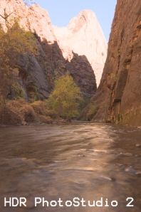
Many photographers DO recognize that HDR and its related techniques are a
breakthrough of sorts. For these photographers subtlety is the key (sHDR?):
tamed skies, no halos, contrast and some shadows. You will find their
postings far more frequently than the shrill cries of anti-HDR people. It
really is a tool to use or abuse or ignore. The choice is yours. I wouldn't
campaign one way t'other. I just know that it is an important technique for
me but I also recognize that my tastes and proclivities will change over
time (thank Buddha). I hope people will appreciate my images for WHAT they
are and not obsess over how I created them. Hope is a good thing.

Imgp9973_4_5_60imgp9973_4_5_6


10 February 2010

Look at your feet...occasionally

A fellow photographer friend (let’s call him Will) was telling me a story about a group photo shoot at the SLC Main Library (http://www.flickr.com/photos/clayhaus/3955090258/in/set-72157613429118501/). (If you don’t know this building it is an award winning modern structure with enough movement and interest that it won over this die-hard lover of Romanesque and Gothic architecture.) While the other photographers were scattered about getting the best angle on the sweep and flowing lines of glass, concrete and metal, Will was aiming his camera at a puddle. Someone came up to him and said: “With this beautiful building in front of you, you shoot a puddle?!” Will said something to the effect of: “There are plenty of others to shoot the building…no one is capturing this puddle.” Now, whether this puddle was ‘worth’ capturing is not the point (and perhaps a subject for another post).

Another example: Ansel Adams was shooting with his friend Brett Weston. In those days Brett was carting around a 11 x 14 field camera while Ansel ‘only’ had an 8 x 10. So there is Ansel setting up for one of his gorgeous zone-system-to-the-max landscapes and he looks over at Brett and starts laughing. Weston had his massive camera pointed at a pile of leaves some 5 feet away. If you have ever seen any of Weston’s foliage shots, you know THEY were worth it.

The photos in this post show 3 different examples of looking at a scene. All were shot at about the same vantage point at Cardiff Creek, just below Donut Falls. However, each photo has a very different feel. I’m not saying which is “best” – though I have my favorite – just that as landscape photographers we shouldn’t always keep our eyes fixed on the horizon. Scan the skies…then look at your feet!

Imgp1182-vfImgp1180-vfImgp1179-vf

21 January 2010

Bryce Canyon in Winter


Bryce in winter is sublime. Red and orange hoodoos draped and dappled with white snow present a fantasy land of forms and shapes, patterns and abstracts. Stark trees framed against undulating snow coax compositions impossible in warmer months. Cloudy, cold skies force a different photographic approach to the landscape, as well as briskly encourage you to keep moving and generate some heat. Serendipity is with you ... or not. Having just returned from Bryce Canyon National Park I can share some tips.


To start with, Ruby's Inn is really your best choice for lodging. They offer special, very low winter rates and have the only open restaurant "in town" during that season. The rooms are nice, spacious, feature a refrigerator and microwave and have free Internet for those interested in immediately sharing images (as I was). 

One of the beauties of Ruby's Inn is that it is but 5 minutes from the park entrance with perhaps another 5 minutes to the first two prime viewpoints: Sunrise and Sunset. These two viewpoints coupled with Inspiration and Bryce, comprise the quadriad of viewpoints over the main amphitheater. For our two mornings in Bryce we chose Sunset and Inspiration, though you really can't go wrong setting up in any of the 4 viewpoints. The lowest of the points, Sunset puts you closer into the amphitheater with views both north (to Sunrise) and south (to Inspiration and Bryce, in order). You can also drop down a few meters or so on the Navajo Loop trail and catch first light on Thor's Hammer. It is a small viewpoint so with a lot of photographers I would find it untenable to maneuver (I like to shoot sunrises/sunsets with two bodies with different focal length lens on two tripods). I really liked Inspiration Point. There are three main "platform" viewpoints separated by a long ridge line. I actually choose the ridge line about 15 meters above the mid-platform. It afforded me an incredible panoramic view of the amphitheater but also allowed me to shoot south towards Bryce Point. I also loved the fact that I had a few tall pines that I could use as framing objects. Finally, not being bound by platform railing permitted to shift my tripods at will. Oh yes: did I mention that no one intruded upon my space!


We arrived at the viewpoints each morning about a half hour before the sun rose. This allowed setup time, but more importantly, I love shooting the pre-dawn light and both mornings it was sublime.


(A word about clothing: bring plenty and layer. Cover your head and hands as well. I love my pair of REI mitten/gloves that allow the mitten part to slip up just exposing the finger tips for working with the camera controls. Even then, my hands got cold at times.) 


After sunrise, the place to be is down in hoodoos. The morning light (as well as the late afternoon) glows amongst the tall red rock spires. You want to capture that. The Navajo Loop is very nice but I really enjoyed the varying landscape and compositional possibilities along the Queen's Garden Trail. I used a variety of focal lengths -- 12-70mm -- as well as my infrared cameras. I was able to obtain some very effective images with the use of the latter. There are times when the stark contrast provided by IR produces far more striking photographs than conventional cameras. Additionally, we had one day of near-total overcast. It was a flat, non-colourful, "B&W day" and I chose to explore it predominately with IR. 

There is more to the park than the 4 main viewpoints and the amphitheater below them. The road extends another 15 miles south ending at the 1000 foot higher viewpoints of Rainbow and Yovimpa. The view south to Arizona from these points is amazing though unfortunately Navajo Mountain was shrouded in some bilious coal plant plumes. I was surprised and disappointed to see that. 


There are numerous view spots to stop at on the drive south, but frankly if you are time-limited, you'll be better served (photographically-speaking) by staying north. In fact just north of the main amphitheater is another fascinating area: the Fairyland Trail. During the summer the 8+ mile trail can be completed in 3-4 hours but with snow the going is slo-o-o-o-w. We hiked the short section to Tower Bridge from Sunrise Point. The destination was a wee bit underwhelming but the journey was incredible. You quickly descend into a fantasy land of strange walls and pillars separated by silent fields of snow. We saw not a soul.


Before dropping into the various basins inquire at the park ranger station as to the condition of the trails. I brought my snowshoes (they weren't needed where we went) but unfortunately left my Yak-Tracks at home. I really could have used the latter as there were quite a few icy patches with a steep pitch down-slope if you were not mindful. Since the last snow had been 10 days or so before our arrival, the trails were relatively well-packed and easy to follow. I would not want to be breaking trail or route-finding in fresh snow, however.


Sunsets are somewhat of a non-event in Bryce. The amphitheater is in shadow, though the light on the Aquarius Plateau to the east can be stunning. I chose to be below Sunrise Point both evenings and the light was photogenically soft though there was no super dramatic sunset ops. The ranger informed as that a lot of photographers go to Red Canyon (west on Hwy 12, some 10 miles or so) for sunset shots. It seems the angle is better-suited for the sundown...next time perhaps.


One suggestion: for the early-to-mid-morning and the mid-to-late afternoon wanderings through the hoodoos, you will encounter deep shadows. If you have never tried HDR photography, this would be a good time. Three-to-five shot brackets of 1.5EV will provide you with a wealth of dynamic range to play with. Even if you don't do HDR, think about bracketing. More often than not I found that the snow threw my internal meter off and I needed to shoot between +0.5 and +1.5EV.


Finally, whether tangled up in the hoodoos, or high above surveying them from a viewpoint, think about pan shots. Whether you stitch or have a dedicated panoramic camera Bryce is a pan-maven's paradise. I brought our my now-discontinued Hasselblad XPan II and shot a whole roll between 8 and 10 am.


I've always wanted to see and shoot Bryce in the winter. The weather gods treated us well and we were thusly rewarded. Hopefully you will be also.


14 January 2010

Avoiding the Cliché


There are many beautiful photographs of the world's icons, be they natural or man-made. How many gorgeous shots of the Eiffel Tower or Taj Mahal or Machu Picchu have you seen? Closer to (my) home, how about sumptuous images of a Mesa Arch sunrise (upper-left) or Delicate Arch at sunset (lower-left)? As an aspiring (emerging, struggling -- yes, they all apply!) photographer, there are times when I look at some of the masters' works and despair (see Ansel Adams' Yosemite collection for just one obvious example). But, you have to fight that "why bother" mentality and continue to try and create something striking, meaningful, well-executed and yes, perhaps even unique (while avoiding the well-trod clichés).

Those adjectives do not always seem to be in congruence. Intent must be factored in. Understand why you are shooting this particular landmark. Is it for fine art purposes, stock agency, your portfolio or a personal project, editorial or marketing assignment, etc.? What are the requirements? What do you hope the outcomes will be? If you are on assignment the client may have provided a clear idea of what she wants and your creative tendencies may be necessarily constrained. Or maybe you are "just shooting" and don't know what the end use of the images will be. Regardless, try and bring those four adjectives into one image: striking (attractive, compelling, makes someone stop and say "wow" or maybe even "huh?"), meaningful (a pretty picture is just that, but a meaningful image will resonate at a deeper level, even if it only means something to you, the artist), well-executed (the technical part: composition, lighting, post-processing...does it all add up? Do the pieces work together?), and unique (Have you avoided the standard view? Are you being creative or repetitive?).

For every nugget of wheat, a field of chaff. So too with iconic images. Avoid snap-shooting, take the time to "read" the location and work at it. There will be occasions when the first three elements may come together easier while you struggle for that sense of uniqueness. In those cases, shoot the standard, "money" shot: at the least you may have something that is salable. But, you also may find that uniqueness is the child of post-processing.

Ansel Adams too spent a long time in his darkroom.